Top 6 Strategies for AdSense Ads Placement for Revenue Growth

Hosting third-party Advertisements is the way of revenue to most of the blogs and content websites.
Google Adsense is the most sought advertisement program for online publishers who monetize their websites.
And everyone who knows about online advertising or earning through their blogs and website would agree with this statement.
Why Google Adsense has become the most used?
The answer is simple. Google Adsense provides many features for customizing the ads and different sizes that go seamlessly with the website content.
Do you have significant web traffic but less revenue from your website? If this is the case, then you need to consider the placement of AdSense ads on your website.
The Ad placement strategy depends on the type of content you host on your website, the type of theme, and the layout it uses.
Among the following strategies that we are going to discuss, you can try out two or three strategies based on your content type and website layout.
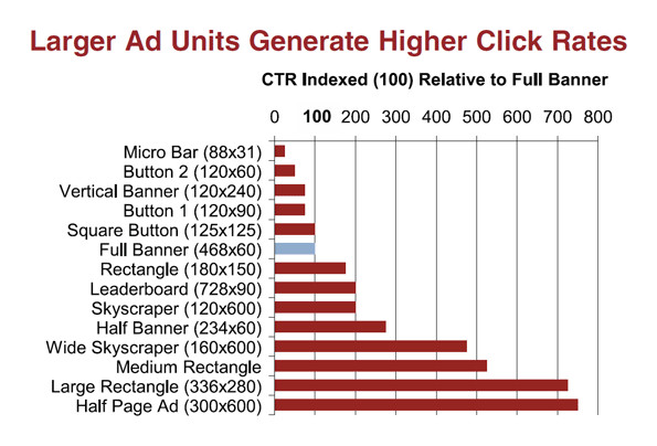
The increase in revenue mainly depends on choosing an AdSense Ad placement strategy that best fits your website. There is no predefined mantra that just shoots your revenue to the top.
Try the ones you think apt for your website, and find out your own best fit.
Top 5 Strategies for AdSense Ads Placement for Revenue Growth
In this article, we shall look into different ad placement strategies for Adsense Ads on a desktop website. Google Adsense provides advertisements for different sizes and different formats, optimizing the Ads placement may wonder to your revenue growth.
1. Basic Strategy With Minimal Number of Ads
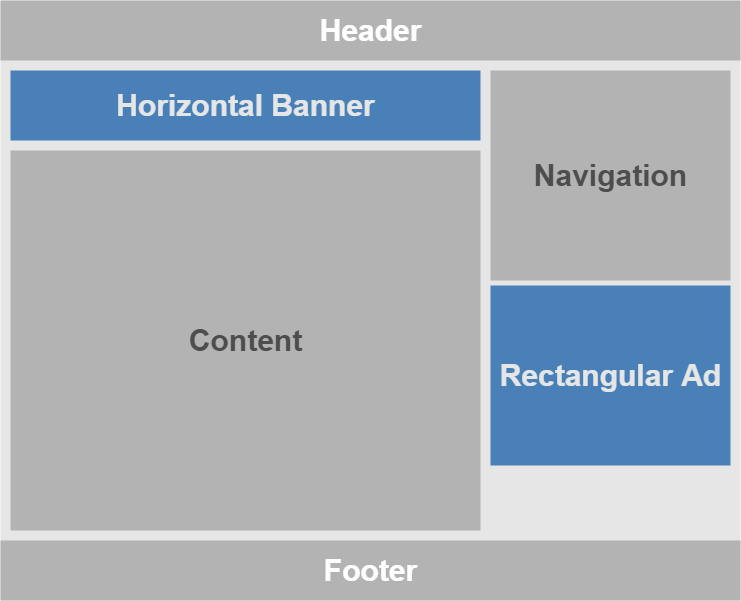
Assuming that you are using a theme with header, content, navigation, and footer as shown in the above picture, you can place two ads that do not obstruct users from using your website.
Content is usually wide and you can place a Horizontal Banner (Leaderboard) of size 728 X 90, 970 X 90 or 970 X 250 on top of it.
Navigation is relatively narrower. So, you can keep a rectangular ad of the size of 336 X 280 or 300 X 250 ; or you can place a vertical banner of size 300 X 600.
In this ad placement approach, we do not place any ads in the content. The horizontal banner ad that appears is in above the fold content. The rectangular ad depends on the size of the navigation.
If the items in the navigation are fewer, it may also appear in above the fold content, else it may appear when the user scrolls the page.
2. Less Rigorous AdSense Ad Placement
Note: The different sections of the actual website layout may vary in length and width. The content section could be way longer.
When compared to the previous strategy, we place the Rectangular Ad (336 X 280 or 300 X 250) above the Navigation.
And below the Navigation, we keep a Link Ad (200 X 90) which usually displays two links. You can also make use of Responsive Links which display about 4 links stacked vertically.
Also, we add another horizontal Banner at the end of the content.
There is another alternative to this approach. Instead of the Link Ad and bottom Horizontal Banner, you can place a large Billboard Ad (970 X 250).
The following picture illustrates the ad placement with Billboard Ad.
3. Rigorous AdSense Ad Placement
This approach is rigorous in terms of the number of ads. Also, we place ads inside the content.
Note: Use this only if you have huge content on your web pages.
Also, read AdSense Terms of Use where you should not fool the user by mimicking an ad as content or prompt the user to click an ad.
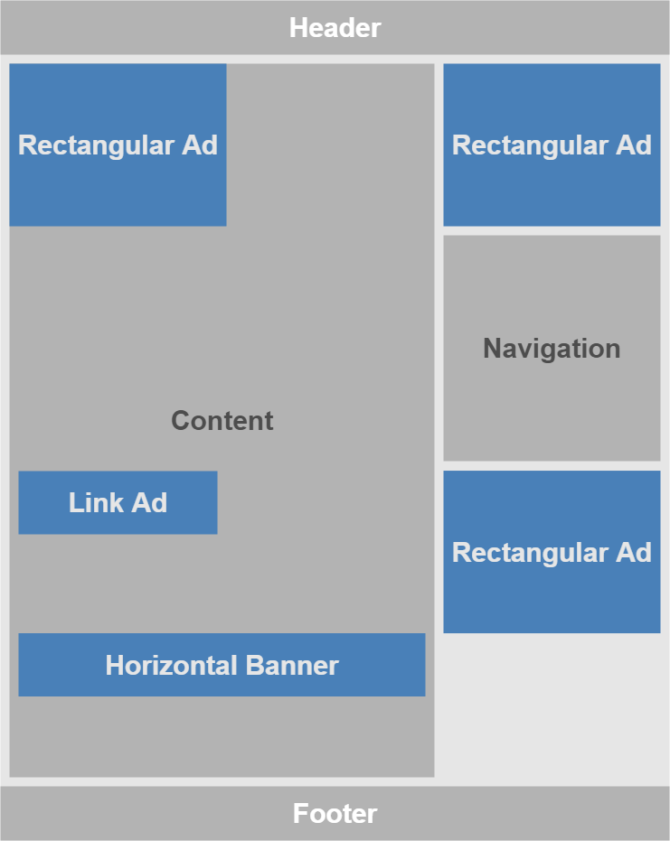
In this rigorous approach, we place a Rectangular Ad that is left aligned. The content flows next to the ad. In between the content you can place a Link Ad.
Make sure that the link ad does not come after listing of links or anything that resembles Link Ad.
While you are about to reach the end of the content, place a Horizontal Banner that spans the width of the content section.
Based on the Content, you can switch the places of ads in your content.
Two Rectangular Ads are placed around the Navigation, one above it and the other below it.
4. More Rigorous Approach of AdSense Ad placement
When compared to the rigorous scheme of ad placement, this layout contains an additional Billboard Ad that spans the width of the page above the footer.
And a large Vertical Banner instead of a Rectangular Ad below Navigation.
If you are using Left Navigation, there are no many changes that you need to do. You can still use the above-mentioned strategies.
AdSense Ad Placement with Layout containing Left Navigation
Use appropriate sizes for the Rectangular and Banner Ads.
6. Try Auto Ads offered by AdSense as an Experiment
Google Adsense has many features like Responsive Ads, Auto Ads, etc.
Auto Ads has grabbed the attention of most of the content publishers who are using Adsense as their advertisement platform.
Auto Ads enable users with a choice to let Google decide where to keep what kind of ads.
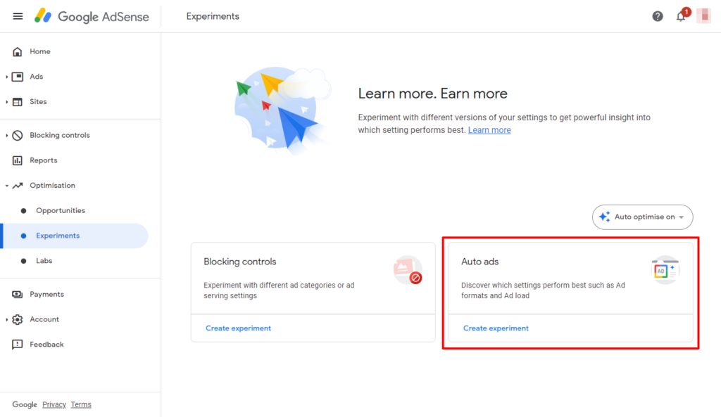
You should also try the Auto ads in the experiments section to understand which type/size/location of Ads perform best on your site. Learn more about setting up the Auto ads on Google AdSense here.
What is your favorite approach for AdSense ads placement on your site, do share your views via the comments section below.


